JUX CSS3 Mega Menu
- created: 04/15/2015
- latest update: 02/21/2020
- By: Joomlaux
- www.joomlaux.com/
- Email: contact@joomlaux.com
1. INTRODUCTION
1.1. What is CSS3 Mega Menu
Often used on e-commerce or large scale websites, mega menus are becoming more and more popular as they offer an effective solution for displaying a lot of content while keeping a clean layout.
JoomlaUX’s JUX Mega Menu is a powerful mega menu designed for Joomla site. It helps you bring pictures, videos or even modules onto a submenu.
CSS3 Mega Menu is Mega Menu which support you style for your mega menu easier with various options such as: Choose Orientation,show/hide Sticky, the algnment, background, color, padding, magrin, Animation effect for dropdown. Select Hide, dropdown type or Off Canvas Type for Menu for small screen size.
NOTE: You can’t create two module CSS3 Mega Menu on 1 page.
1.2. Features
- Horizontal or Vertical Orientation
- Flat or gradien background supported
- Sticky menu supported
- Various animation effects
- Set border, padding, margin, radius, box shadow
- Text & hover, text color , background & hover background color
- Select Hide, dropdown type or Off Canvas Type for Menu for small screen size.
- Compatibility with mobile browsers: iPhone & iPod, iPad, Android…
- Support all major web browsers: IE10+, Firefox 2+, Safari 3+, Chrome 8+, Opera 9+…
2. SCREENSHORT
2.1.Frontend


2.2.Backend


3. REQUIREMENT
Our extension has several system requirements as follow:
- Apache 2.0 or above - http://www.apache.org recommended: Apache 2.0 or above.
- PHP 5.2.4 or above - http://www.php.net recommended: PHP 5.3 or above.
- MySQL 5.0.4 or above - http://www.mysql.com recommended: MySQL 5.0.4 or above.
- Joomla! 3.x http://www.joomla.org
- You have to ensure that your system has already installed, XML and Zlib-Support built into your PHP.
PHP should be compiled with support for https (openSSL) and cURL.
PHP Safe Mode should be turned off.
Client Requirements
This module can run well on major browsers such as: Internet Explorer (version 10+), Firefox, Chrome, Opera, and Safari.
4. INSTALLATION
4.1. Download
After purchasing our product, you’ll see the download link at JUX CSS3 Megamenu product page: http://www.joomlaux.com/download.html
Note: If there is any problem, please contact us via Support : http://www.joomlaux.com/forum/index.html
4.2. Package
The installation package that you downloaded to your computer. You’ll see these files:
|
Modules |
pkg_jux_ css3_megamenu |
4.3. Installation
Go to Administrator site / “Extensions”/ Extension Manager in the Top menu.
In “upload package file” block, please upload & install our extensions:
Browse the JUX CSS3 Mega Menu folder, select pkg_jux_css3_megamenu.zip then choose upload and install

Figure 1: Extension Manager
5. TIPS AND TRICKS
5.1. Tab Module
- You can choose Theme menu (Sparkling Sife, Back White, Red Black….or Custom CSS).
- If you choose Custom CSS, you can choose configure for menu in this tab such as: Top Menu Style, Dropdown Menu Style, Menu Items Style.
- In this tab, you also can choose to show number of level for menu item, orientation for menu is horizontal or vertical.
- You can set sticky menu when scroll pages.
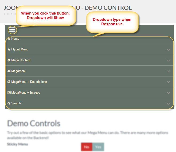
- On small devices, you can select Hide, No responsive or Responsive Menu. If you select to Responsive, your menu will display dropdown type or Off Canvas Type. Especially, you can show/hide Custom Module in Menu when it display on small devices.

Figure 2: Backend for Top Menu
|
Menu theme |
Choose one of the style for your Menu NOTE: You can custom CSS |
|
Select Menu |
Select a menu for module to show |
|
Start level |
Level to start rendering the menu at. Setting the start and end levels to the same # and setting “Show Sub- menu Items” to yes will only display that single level. |
|
End Level |
Level to stop rendering the menu t. If you choose “all”, all levels will show depending on “ show sub-menu items’ setting |
|
Orientation |
Choose Horizontal or Vertical Menu |
|
Submenu Direction |
Direction for submenu, default is Down, if you use the mega menu at bottom of page, you can use direction Up.(NOTE: if you choose Horizontal for Orientation). Default is left to right. If place vertical mega menu to the right, this should be right to left (NOTE: if you choose Vertical for Orientation).
|
|
Show Module |
Show/hide your module in off canvas or dropdown when resize browser to a low resolution or view on a smartphone |
|
Sticky Menu |
Show/Hide sticky menu on desktop |
|
Sticky menu Alignment |
Menu will set alignment left or right or center (NOTE: If Show Sticky menu) |
|
Animation |
Animation effect for dropdown of Mega menu CSS3 |
|
Animation Duration(ms) |
Animation effect duration for dropdown of Mega Menu CSS3( in milseconds) |
|
Menu Alignment |
The alignment of menu: Left- Right- Center. |
|
Responsive Menu |
If yes, The menu will collapse to a ‘Navigation’ menu item when resize browser to a low resolution or view on a Smartphone. |
|
Mobile tablet |
Select off Canvas or Dropdown type on mobile and tablet ( NOTE: If Choose Responsive Menu) |
5.2. Tab Top Menu Style
NOTE: You only configure this tab when choose Custom CSS for Theme Menu
You can select background style is Flat or Gradient and choose color after that. You can change size of margin, padding for menu item on Top Menu. Further more, If you like your menu have radius, you just need to enter pixels number in border radius.

Figure 3: Backend for Top Menu

Figure 4:frontend for Top Menu
|
Background Style |
Choose a background style |
|
Background Color |
Set background color for Top Menu |
|
Border |
Set Border for Top Menu |
|
Padding |
Set padding for Top Menu |
|
Margin |
Set margin for Top Menu |
|
Border Radius |
Set Border radius for Top Menu |
5.3. Tab Dropdown Menu Style
NOTE:You only configure this tab when choose Custom CSS for Theme Menu
You can design for Dropdown Menu in this tab. You can set color for background, border. Set padding, margin, padding, border radius and box shadow for it.

Figure 5: Backend for Dropdown Menu

Figure 6: frontend of Dropdown Menu
|
Background Style |
Choose a background style |
|
Background Color |
Set background color for Dropdown Menu style |
|
Border |
Set Border for Dropdown Menu style |
|
Padding |
Set padding for Dropdown Menu style |
|
Margin |
Set margin for Dropdown Menu style |
|
Border Radius |
Set Border radius for Dropdown Menu style |
|
Box Shadow |
Set box Shadow for Dropdown Menu style. |
5.4. Tab Menu Items Style
NOTE: You only configure this tab when choose Custom CSS for Theme Menu
You can changes color for text or background of Menu Item and select other color when hover on it.
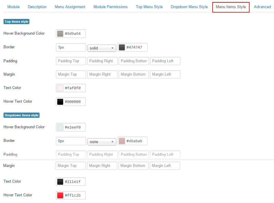
Figure 7 : Backend for Menu Items

Figure 8: Frontend for Menu Items
|
Hover background Color |
Set hover background color |
|
Border |
Set Border |
|
Padding |
Set padding |
|
Margin |
Set Margin |
|
Text Color |
Set color for text |
|
Hover Text Color |
Set text color when hover |
5.5. Tab Advanced
You can custom css for Mega Menu in here

|
Custom CSS |
Custom CSS |
|
Module ID |
The id of the module, if you use multiple JUX Mega Menu modules on the same page, you have to make sure this field is different for each modules. |
|
Enable Bootstrap |
Enable Bootstrap( NOTE: when your site still haven't bootstraps yet, please enable it. And usually enable bootstraps when using yoo_ template ) |
|
Enable jQuery |
On/Off jQuery loader/ Turm it off your site alrady have jQuery loader |
|
Enable noConfict |
A suffix to be applied to the CSS class if the module. This allown individual module stying. |
NOTE: when CSS3 Mega Menu have the problem with yootheme template, you can refer the solutions How to fix JUXMega Menu display at Drop-down menu on YooTheme template
5.6. Menu Item parameters.
After you install our CSS3 Mega Menu, each of a menu item will have an additional parameter pack which named Parameters (JUX Mega Menu CSS3). Please note that in this section, we’ll call “current Menu Item” as the item that the parameter is being set
NOTE: when set for Submenu Columnb[i] width, Please don't enter space between them. example: write right: colw1=822 and write wrong: colw1 = 822
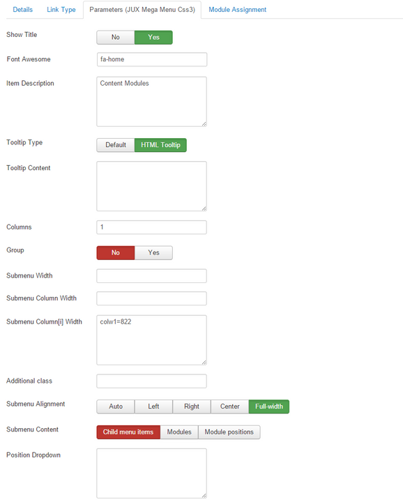
Figure 9: Backend for Menu Item Parameters
|
Show title |
Show/hide Title |
|
Font Awesome |
Set icon for Menu item |
|
Item Description |
Description added here will be shown as the tag line below the Menu Item title. Work for all level of menu |
|
Tooltip Type |
Show tooltip type for this menu item, default is Global in “Link Type options/Link Title Attribute” option, select HTML tooltip to create a HTML Tooltip content |
|
Tooltip Content |
HTML Tooltip content for this menu item when you selected “HTML Tooltip” for “Tooltip Type” option |
|
Column |
Number of Column that the sub-items of this Menu-item will be divided into. |
|
Group |
If set to Yes, This menu Item will display with all the direct sub-items of it. |
|
Submenu Width |
Set the width of the Submenu of this Menu Item. |
|
Submenu Column Width |
Default width for each Submenu’s column (If you do not enter value, it will display with default value: 200px) |
|
Submenu Column[i] width |
Specify width for individual column. Please use format the same as below: Colw1=170 colw2=250 colw3=360
|
|
Additional class |
Additional CSS class to apply to this menu item. |
|
Submenu Alignment |
Set “Auto” to make submenu align automatically, set a specific alignment value to make it align by your choice |
|
Submenu Content |
Choose content to show in submenu of this menu item. You can select module position or module |
|
Position Dropdown |
You can enter number px for top, left, bottom or right, for dropdown. Example: top:5px; Left:5px;
|
6.EXAMPLE
6.1. How to add icon to your menu item
Our Mega Menu use “Font Awesome” that set for a Menu Item as the icon. You can add icon for your Menu Item by following these steps:
1. Go to link : http://fortawesome.github.io/Font-Awesome/icons/
2. Find icon you like and copy name of it, and paste in Font Awesome in parameters.
Example: Icon for Home Item.
You will find it as image below in fortawesome.github.io

You only copy words fa-home and paste it on Font Awesome in Paramters

Figure 10: add icon for menu item

Figure 11: Show icon for Menu Item
6.2. How to group menu items into columns
After you installed Mega Menu, the menu hasn’t showed as a complete Mega Menu yet. It will display similar to a regular dropdown menu:

Figure 12: display default for Dropdown Menu
6.2.1. Display all child of each menu item on one column
If you configure for Monday is group. All child of it will display as image below:
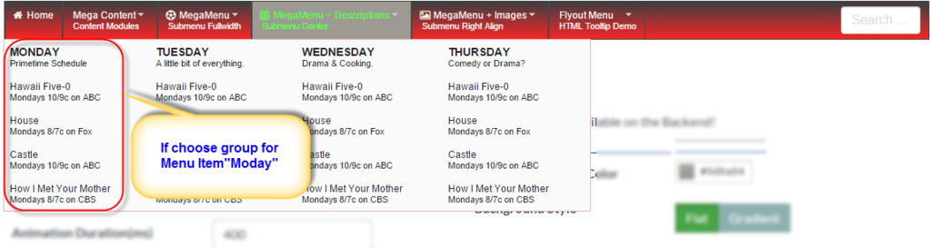
Figure 13: Display Child of Menu Item if choose Group
This is configure in backend for Monday Item
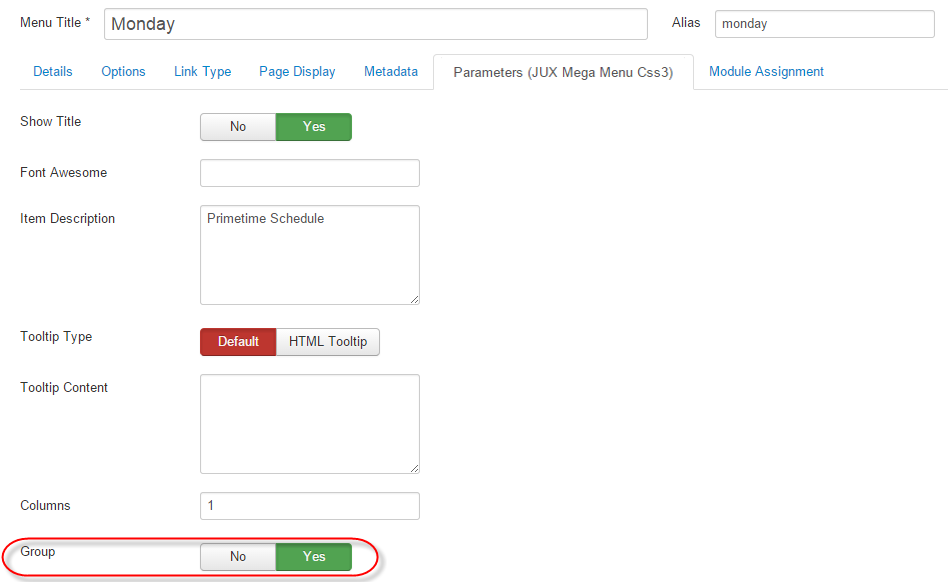
Figure 14: select group for Menu item in parameters
6.2.2. Divided multiple columns on one Rows
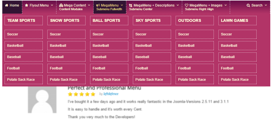
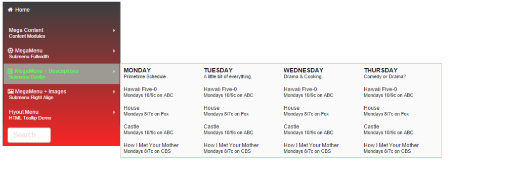
If you want your menu have multiple columns on One Row as image follow:

Figure 15: Divided multiple columns
Please configure for they the below:
MegaMenu + Descriptions have to 4 childs respectively: Monday, Tuesday, Wednesday, Thursday
Monday, Tuesday, Wednesday, Thursday can have/ have not child.
Step1: Configure for Mega Menu + Description as image below

Step 2: Configure for each Child of “MegaMenu + Descriptions”
This configure for Monday (with Tuesday, Wednesday, Thursday, you can configure same)

Step 3: If Monday have child. You can configure it as image below:

6.2.3. Divided multiple Rows
If you want have multiple rows for your menu, you can follow the steps as below.
At here I have Mega Content will have 2 rows as image:
Step 1:
- I will create 2 Menu Item name: Mega_content 1 and Mega_content 2. They are childrens of Mega Content.
- Mega_content 1 and Mega_content 2 will have children as image

Step 2: Configure for mega_content 1(Mega_content 2 will configure same)
(NOTE: You have to hide Title of Mega_content1(Mega_content 2)
NOTE: with Menu item as From The Blog, Advertisment, Contact … you can configure same "Divided multiple columns on one Rows"
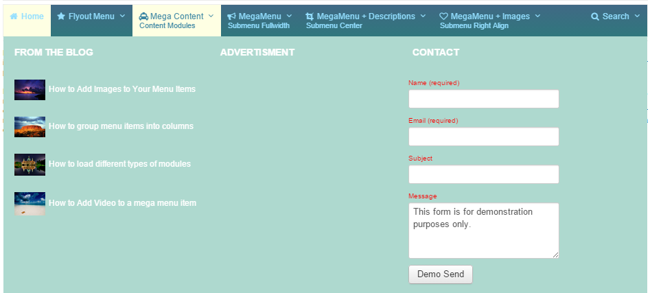
6.3. How to load different types of modules into your menu items

Step1: Create a Menu item, that you want to load module
Step2: In the Menu Type selecting windows, please choose the External URL in the system Link group
Step3: Select Modules for Submenu Content

6.4. Loading embedded video
Please view this video:
6.5. Guide configure in backend for CSS3 Style
Please view this video folow:
7. FRONTEND
Use theme menu is various vintage

Use Flat style for Mega Menu

Use Gradient style for Mega Menu

Use Mega Menu in vertical position.
Configure Margin, padding, Radius for Top Menu

Use Box shadow for Dropdown Menu

Off Canvas Type for Menu for small screen size

Dropdown Type for Menu for small screen size
