GRANDE
DOCUMENTATION
From
JOOMLAUX
Welcome to our Profile. Grab your drink and let’s get to know each other a little! We are Joomlaux (“jux” is pronounced as /nu:/ if you don’t know how). We’ve been working and creating and playing with Joomla for several years. Our team has highly skilled & experienced geeks who share passion and desire for Joomla, of bringing better work to Joomla Community. Sometimes we honestly think we’re just children playing around with work & everything to us boils down to curiosity. Work smart. Play hard. Be curious. Try new things. These are the values we respect in anything we do. We’re interested in what’s good. You ain’t different, are you? We designers and developers should always keep the users in mind when we work. Ralph Marston once said “Excellence is not a skill, it is an attitude”
TEMPLATE INSTRUCTION
1. About Joomla version used in JUX Grande
All Joomlaux templates run on Joomla 3.x version (Joomla 3.0, 3.1…). Therefore, your site must install Joomla 3.x version to use our template. The installation of Joomla 3.x only requires a few steps and you can do within a minute!
2. About JUX Grande
Compatible with Joomla 3.x and built with Bootstrap3, HTML5 & CSS3, K2, Grande is a Modern Corporate Joomla Template that goes with necessary features for a corporate website: Unite Revolution Slider 2 integrated for alluring slider, Acymailing and JoomShopping compatible, JUX Portfolio and JUX Portfolio built in to show up your work, contact page with JUX Google Maps, various shortcode options, sticky mega menu, interesting number counter, and number of bonus page. Designed for a professional corporate website, Grande has modern and clean look whether in dark or light skins, full-width or boxed layout. You are able to choose from 4 premade styles, 3 blog layouts, and 2 portfolio layouts or customize yourself easily. Now it is time to take a tour and grab it for your amazing corporate website coming up!
3. About JUX Grande Template User Guide
The user guide provided is to help you to quickly learn about JUX Grande template and how to use it easily. This documentation is recommended for both non-advanced & advanced users. Please read carefully.
Main aspects covered in the user guide:
- Template Instruction
- Download & Install
- Homepage Setting
- K2 page Setting
- Portfolio Page Setting
- Template Customization
- Megamenu Configuration
- Logo Customization
- Recommendation
4. Features
- 100% Responsive & Retina ready
- Clean and refreshing design
- Dynamic Sticky Mega menu built in
- Smooth Parallax Scrolling for eye-catching look
- Compatible with Joomla 3.x
- Built with Bootstrap, HTML5 & CSS3, K2
- Numerous premade Layouts and Skins
- Unite Revolution Slider 2 (worth $25) Built In
- JUX Portfolio (worth $17) integrated
- JUX Portfolio (worth 20 Euro) integarted
- Various Shortcode options
- Fully compatible with Joomshopping
- Fully compatible with AcyMailing.
- Joomla bonus pages: contact form, error 404 page, blog...
- Font Awesome Icon Integrated
- Comprehensive documentation included
- Optimized and LESS CSS for SEO on site
- Cross browser compatibility: IE9, IE10, Firefox, Chrome, Opera and Safari
- Flexible customization and user friendly
- Delivered with Quickstart Installation
- Extensive online and offline documentation
- Top-notch Customer Support
- All images in main PSD and Quickstart were generated from Placehold.it to help you know exactly image size.
5. Joomlaux Extensions Supported
- JUX Portfolio
- JUX Google Map
6. 3rd Party Extension Supported
- K2 Component
- Unite Revolution Slider 2
- JoomShopping component
7. Layout & Module Positions
Layout
Here are 3 different layouts used in JUX Grande template:
-
Content- Sidebar
-
Sidebar-Content
-
No-Sidebar
Module positions
Take a look at the picture below for all modules’ position on JUX Grande

8. T3 Framework
T3 framework is a popular Template framework for Joomla 3.0 using Bootstrap. JUX Grande uses T3V3 framework which comes with brand-new look, design approach and incredibly powerful customization feature. Please follow the links provided below to learn more about T3 framework and its implementation.
8.1 T3 Framework Introduction
More about T3 framework, please visit HERE
8.2 T3 Installation
Please visit HERE
8.3 T3 Setting
Please visit HERE
8.4 Layout System
Please visit HERE
8.5 Customization
Please visit HERE
DOWNLOAD & INSTALL
1. Plan your site Developer
1.1 Kick-start a New Joomla Site? - If you are planning to start fresh with a new Joomla site, then use our Quickstart package to quickly clone the demo site, then replace the demo content with yours. Check the How to install Quickstart Package documentation for the in-depth how-to guide for Quickstart Installation.
1.2 Install on your existing live site? - If you are planning to use this template for your existing Joomla site, then you should follow the How to make your site look like demo site guide first to dig in the steps involved.
2. Download Template and Extensions
After you purchased our menu, please following the instruction to download the package. You’ll then find our template zip file inside the package
3. Install Template and Extensions
Once you successfully Download the files you need, You'll have to:
- Install the template files into your Joomla system.
- At default, during the installation process,JUX Grande template will be installed with the settings we're used as on the demo website. Therefore, if you would like to make any changes in configuration, it's recommended that you should complete the setup (including installing all the modules and plugins along with the templates as on demo) then carry out any customization afterwards
HOMEPAGE SETTING
Here is frontend of Homepage
On Homepage, There are many positions, each position loads one module. This document will help you create and configure modules in homepage.
Let’s scroll to see our document
1. Module name: Slideshow Homepage
Module type: Unite Revolution Slider 2

Position: slideshow
Frontend

To learn more about this module. Please see DOCUMENTATION
2. Module name: WE ARE GRANDE
Module type: Custom HTML

Position: grande-instroduction

Custom HTML

<div class="des">

<p>Morbi accumsan vehicula urna vitae feugiat. Fusce iaculis pellentesque elit, quis rutrum eros mattis ac. Mauris ultrices tortor diam, ac dignissim ipsum egestas nec. Vestibulum pharetra pulvinar pharetra. Proin commodo a mauris nec luctus.</p>

</div>

<div class="row services">

<div class="col-sm-4">

<i class="fa fa-leaf"></i>

<h4>CLEAN & MODERN DESIGN</h4>

<p>Sed bibendum maximus est quis laoreet. Proin placerat orci eget nisi tempor gravida. Integer lorem risus, tincidunt eu posuere vel.</p>

</div>

<div class="col-sm-4">

<i class="fa fa-mobile"></i>

<h4>FULLY RESPONSIVENESS</h4>

<p>Sed bibendum maximus est quis laoreet. Proin placerat orci eget nisi tempor gravida. Integer lorem risus, tincidunt eu posuere vel.</p>

</div>

<div class="col-sm-4">

<i class="fa fa-download"></i>

<h4>FREE UPDATES</h4>

<p>Sed bibendum maximus est quis laoreet. Proin placerat orci eget nisi tempor gravida. Integer lorem risus, tincidunt eu posuere vel.</p>

</div>

</div>

<div class="img">

<img src="images/browser-group.png" alt="" />

</div>
Frontend

3. Module Our Services
Module type: Custom HTML

Position: our-services

Custom HTML

<div class="row">


<div class="col-sm-4">

<div class="row">

<div class="col-xs-2"><i class="fa fa-mobile-phone"></i></div>

<div class="col-xs-10"><h3>CROSS BROWSER</h3></div>

</div>

<p>Donec et massa malesuada, laoreet lacus non, lacinia felis. Phasellus pretium enim tellus, et aliquet mi fringilla non. Aenean lorem libero, adipiscing.</p>

</div>


<div class="col-sm-4">

<div class="row">

<div class="col-xs-2"><i class="fa fa-cog"></i></div>

<div class="col-xs-10"><h3>EASY CUSTOMIZATION</h3></div>

</div>

<p>Donec et massa malesuada, laoreet lacus non, lacinia felis. Phasellus pretium enim tellus, et aliquet mi fringilla non. Aenean lorem libero, adipiscing.</p>

</div>


<div class="col-sm-4">

<div class="row">

<div class="col-xs-2"><i class="fa fa-star"></i></div>

<div class="col-xs-10"><h3>TONS OF GREAT FEATURES</h3></div>

</div>

<p>Donec et massa malesuada, laoreet lacus non, lacinia felis. Phasellus pretium enim tellus, et aliquet mi fringilla non. Aenean lorem libero, adipiscing.</p>

</div>


</div>


<div class="row">


<div class="col-sm-4">

<div class="row">

<div class="col-xs-2"><i class="fa fa-magic"></i></div>

<div class="col-xs-10"><h3>MODERN DESIGN</h3></div>

</div>

<p>Donec et massa malesuada, laoreet lacus non, lacinia felis. Phasellus pretium enim tellus, et aliquet mi fringilla non. Aenean lorem libero, adipiscing.</p>

</div>


<div class="col-sm-4">

<div class="row">

<div class="col-xs-2"><i class="fa fa-code"></i></div>

<div class="col-xs-10"><h3>BEST PRACTICE CODE</h3></div>

</div>

<p>Donec et massa malesuada, laoreet lacus non, lacinia felis. Phasellus pretium enim tellus, et aliquet mi fringilla non. Aenean lorem libero, adipiscing.</p>

</div>


<div class="col-sm-4">

<div class="row">

<div class="col-xs-2"><i class="fa fa-thumbs-o-up"></i></div>

<div class="col-xs-10"><h3>QUICK SUPPORT</h3></div>

</div>

<p>Donec et massa malesuada, laoreet lacus non, lacinia felis. Phasellus pretium enim tellus, et aliquet mi fringilla non. Aenean lorem libero, adipiscing.</p>

</div>


</div>
Frontend

4. Module name: Our Latest Works
Module type: JUX Portfolio

Position: latest-work

Module Class Suffix: our-latest-works||Aliquam commodo sed diam ut laoreet. Morbi sit amet molestie dui, eget dapibus metus. Nam at facilisis sem
Frontend

5. Module name:Parallax
Module type: Custom HTML

Position: nav-content

Custom HTML


<div class="client-testimonial parallax">

<div class="bg parallax-bg"></div>

<!-- END PARALLAX BACKGROUND -->


<div class="overlay"></div>


<div class="client-testimonial-main">

<h2>YOU ARE JUST HALF WAY.</br>

MORE WORK CAN BE DONE WITH GRANDE.</h2>


<div class="client-testimonial-button"><a href="#">Learn More<i class="fa fa-arrow-circle-right"></i></a></div>

</div>

</div>
Frontend

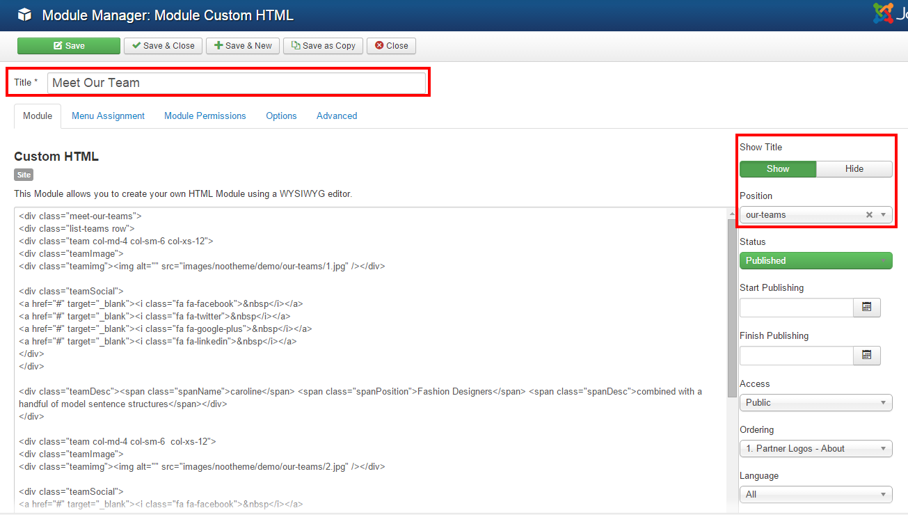
6. Module name: Meet Our Team
Module type: Custom HTML

Position: our-teams

Module Class Suffix: ||Aliquam commodo sed diam ut laoreet. Morbi sit amet molestie dui, eget dapibus metus. Nam at facilisis sem
Frontend

7. Module name: Interesting numbers – Home
Module tyle: Custom HTML

Position: our-teams-numbers

Custom HTML

<div class="our-teams-desc col-md-12">SOME INTESRESTING NUMBERS ABOUT OUR TEAM</div>

<div class="col-md-3 col-sm-6">

<div class="icon">

<i class="fa fa-user"></i>

</div>

<span class="number jux-counter">297</span>

<p>customers</p>

</div>

<div class="col-md-3 col-sm-6">

<div class="icon">

<i class="fa fa-clock-o"></i>

</div>

<span class="number jux-counter">6839</span>

<p>working hours</p>

</div>

<div class="col-md-3 col-sm-6">

<div class="icon">

<i class="fa fa-inbox"></i>

</div>

<span class="number jux-counter">22086</span>

<p>Emails</p>

</div>

<div class="col-md-3 col-sm-6">

<div class="icon">

<i class="fa fa-lightbulb-o"></i>

</div>

<span class="number jux-counter">1978</span>

<p>Solutions</p>

</div>
Frontend

7. Module Our Customers
Module type: Custom HTML
Position: nav-footer

Custom HTML

<div class="our-customers">

<div class="bg parallax-bg"></div>

<!-- END PARALLAX BACKGROUND -->


<div class="overlay"></div>

<div id="carousel-example-generic" class="carousel slide" data-ride="carousel">

  <!-- Indicators -->

  <ol class="carousel-indicators">

    <li data-target="#carousel-example-generic" data-slide-to="0" class="active"></li>

    <li data-target="#carousel-example-generic" data-slide-to="1"></li>

    <li data-target="#carousel-example-generic" data-slide-to="2"></li>

  </ol>


  <!-- Wrapper for slides -->

  <div class="carousel-inner">

    <div class="item active">

      <div class="comment">

        <div class="comment-desc">

          <p>“Praesent luctus varius consectetur. Praesent bibendum, ante nec pellentesque sodales, ligula turpis tristique massa, nec tincidunt urna.”</p>

        </div>


        <div class="comment-name">-- Mark Hain</div>

      </div>

    </div>


    <div class="item">

      <div class="comment">

        <div class="comment-desc">

          <p>“Praesent luctus varius consectetur. Praesent bibendum, ante nec pellentesque sodales, ligula turpis tristique massa, nec tincidunt urna.”</p>

        </div>


        <div class="comment-name">-- Mark Hain</div>

      </div>

    </div>

  </div>

</div>

</div>
Frontend

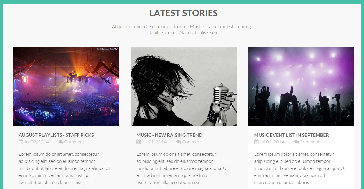
8. Module LATEST STORIES
Module type: K2 Content

Position: latest-stories

Module Class Suffix: ||Aliquam commodo sed diam ut laoreet. Morbi sit amet molestie dui, eget dapibus metus. Nam at facilisis sem
Frontend
9. Module name: Logo Designer
Module type: Custom HTML

Position: logo-designer

Custom HTML

<div class="item  col-md-2 col-sm-4"><a href="#"><img alt="" class="grayscale" src="images/joomlaux/demo/logo-design/footernav-icon1.png" /></a></div>

<div class="item  col-md-2 col-sm-4"><a href="#"><img alt="" class="grayscale" src="images/joomlaux/demo/logo-design/footernav-icon2.png" /></a></div>

<div class="item  col-md-2 col-sm-4"><a href="#"><img alt="" class="grayscale" src="images/joomlaux/demo/logo-design/footernav-icon3.png" /></a></div>

<div class="item  col-md-2 col-sm-4"><a href="#"><img alt="" class="grayscale" src="images/joomlaux/demo/logo-design/footernav-icon4.png" /></a></div>

<div class="item  col-md-2 col-sm-4"><a href="#"><img alt="" class="grayscale" src="images/joomlaux/demo/logo-design/footernav-icon5.png" /></a></div>

<div class="item  col-md-2 col-sm-4"><a href="#"><img alt="" class="grayscale" src="images/joomlaux/demo/logo-design/footernav-icon6.png" /></a></div>
Frontend

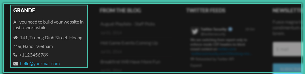
10. Module Grande
Module type: Custom HTML

Position: footer-1

Custom HTML

<div class="about-mod">

<div class="about-desc">All you need to build your website in just a short while.</div>

<div class="contact-address">

<ul class="contact-address">

<li><i class="fa fa-home"> </i> <span class="contact-street">141, Truong Dinh Street, Hoang Mai, Hanoi, Vietnam</span></li>

<li><i class="fa fa-phone"> </i> <span class="contact-telephone">+1123456789</span></li>

<li><i class="fa fa-envelope"> </i> <span class="contact-email"><a href="#">hello@yourmail.com</a></span></li>

</ul>

</div>

</div>
Frontend
11. Module From the blog
Module type: K2 – Content

Position: footer-2
Frontend

12. Module Twitter Feeds
Module type: mod_atom_twitter_feeds

Position: footer-3
Frontend

To learn more about this module. Please see DOCUMENTATION
13. Module Newsletter
Module type: AcyMailing

Position: footer-4
Frontend

14. Module Copyright
Module type: Footer

Position: footer
Frontend

K2 PAGE SETTING
1. K2 Instruction
K2 is a powerful & ideal extension that allows you to powerfully control your Joomla content. K2 provides out-of-the-box integrated solutions featuring rich content forms for items.
To get K2 on your site, download K2 component from the website http://getk2.org/
If you are new to K2, go to K2 guide to install and configure the component in your Joomla site.
2. Install & Configure K2 Component
To install & configure K2 pages, please follow these steps:
-
Step 1: Go to backend: Extensions→ Module manager and upload K2 you’ve downloaded

After uploading successfully, you will have the message and K2 information as below:

-
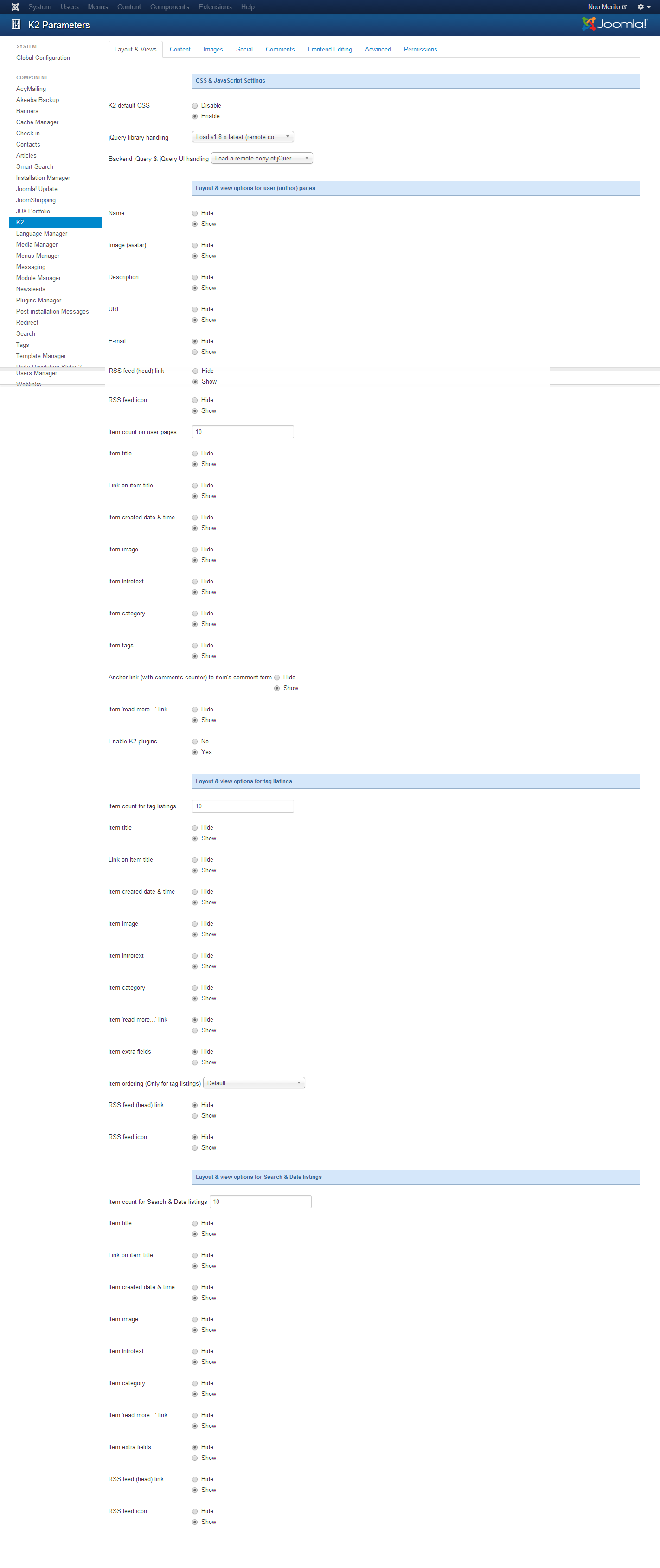
Step 2: Global Configuration
You will find general settings for K2 in Global Configuration. Navigate to System→Global Configuration:
-
Step 3: K2 Categories
To build K2 for your website like our demo, navigate to Components --> K2 --> Categories:

3. Guide how to create & configure Blog Classic page
Frontend of Blog Classic page

3.1 Module Blog Banner
Module type: Custom HTML

Position: slideshow

Custom HTML

<div class="container clearfix">

<div class="mod-banner">

<h3>Blog</h3>

</div>

</div>
Frontend

3.2 Configure each module in side-bar position
3.2.1 Module Tags
Module type: K2 Tools

Position: sidebar
Frontend

3.2.2 Module Calendar
Module type: K2 Tools

Position: sidebar
Frontend
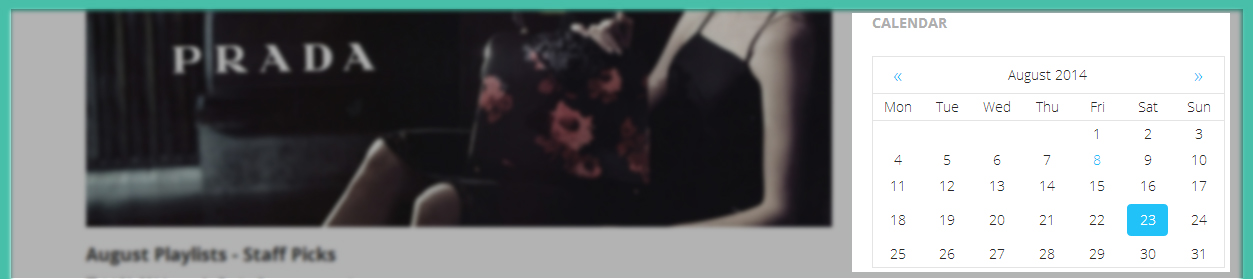
3.2.3 Module Categories
Module type: K2 Tools

Position: sidebar
Frontend

3.3 Guide how to create & configure Blog classic page
Frontend of Blog page

To have blog page like in our demo site, please follow these steps:
-
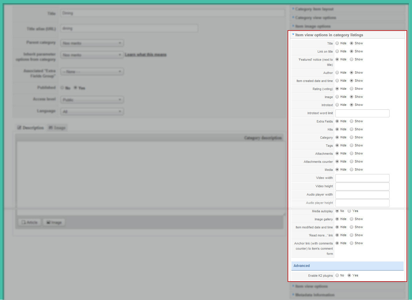
Step 1: Go to backend: Components→ K2→Categories→ Select category you want to display in Blog Classic page and configure:

You can change frontend by changing leading count and Primary count in category.
-
Step 2: You can configure to display or hide items, please configure in Item view options in category listings tabs, you can Show/Hide fields you want to display on frontend.
3.4 Guide how to create & configure Blog Masonry page
Here is frontend of Blog Masonry page:

The Blog Masonry page has the same configuration like the Blog Classic page but you need select template blog-mansory for category you want display in blog page. You can see image below:
PORTFOLIO PAGE SETTING
1. Portfolio Classic page
Here is frontend Portfolio Classic page:

Now we’ll guide you to create & configure each module in this page:
1.1 Module Portfolio Banner
Module type: Custom HTML

Position: slideshow

Custom HTML

<div class="container clearfix">

<div class="mod-banner">

<h3>Portfolio</h3>

</div>

</div>
Frontend

1.2 JUX Portfolio
Page class: jux-portfolio
Frontend

-
Step 1: Create Categories & Item for Jux Portfolio
To learn more about this component, please see our document
-
Step 2: Create menu Portfolio Classic as type Jux Portfolio with the setting below:

JUX Portfolio Options

Page Display

2. Guide how to create & configure Portfolio Full-width
Here is frontend of this page

2.1 Module Portfolio Banner
Module type: Custom HTML

Position: slideshow
To learn more about this module, please see Portfolio Class section.
2.2 Module Our Latest Works - Portfolio – Fullwidth
Module type:  JUX Portfolio

Position: latest-work

Module Class Suffix: our-latest-works
Frontend

TEMPLATE CUSTOMIZATION
1. Creating new Template style
Template style feature (version 2.5 and above) is to assign different template styles to individual menu items. The default template style can be partially or completely overridden by assigning different template styles to the desired menu items in order to obtain a different look for their respective pages.
-
Step 1: Duplicate the template default style:
From backend: Go to Extensions→ Template Manager→ Select template jux_grande – Default then hit the “Duplicate” button to clone template style:

-
Step 2 - assign the template style for menu items:
The duplicated template style inherits all settings from its parent template style except the menu assignment (the cloned template style is not assigned to any menu items). Open the cloned template style → Menu Assignment, then assign the template style to menu items. Those menu items will have template style overridden the default template style.
2. Layout Configuration
2.1 Layout Structure configuration
2.1.1 Clone layout:
To quickly create new layout, clone layout in the layout setting panel, all you have to do is hit the “Save as Copy” button. If you are new to T3, you should clone layout to customize so that you always has backup layout.
2.1.2 Switch layout for any template style
Open any template style, go to "Layout" tab, switch layout for current template style.
2.1.3 Assign module position
To assign module position, hover the position you want to change, hit the setting icon then select position. To change number of positions for spotlight block, just select number of position in the spotlight block
2.1.3 Change number of position in spotlight block
For spotlight block, you can select number of positions. It supports up to 6 positions.

2.2 Responsive layout configuration
2.2.1 Select responsive layout
In configuration panel, you will see supported responsive layouts: Large, Medium, Small and Extra Small, select responsive layout to configure.
2.2.2 Disable any position
For responsive purpose, some elements in your site does not fit in specific layout, you can disable the position in the layout. The configuration is only applied for current layout.
2.2.3 Resign positions in spotlight block
For modules in spotlight block, you can drag to resize its size.

2.3 Layout customization
Sim template is built with T3 Framework , you can refer to T3 documentation for more detail:
2.4 Theme magic configuration
ThemeMagic is to customize your themes based on pre-define parameters without changing any style file.
Firstly, you have to enable the "ThemeMagic" feature. Open any template style manager, in the General tab, enable the ThemeMagic option. Next, hit the "ThemeMagic" button on the top bar list to open the ThemeMagic working panel

Customize your theme with pre-defined parameters
-
Step 1: Select Theme: all theme will be listed here , select theme you want to customize
-
Step 2: Custom your theme with pre-defined paramers. In the setting bar, open the parameter group you want to configure, change value for the pre-defined parameters.
-
Step 3: you can add External CSS Urls to import and use for ThemeMagic. It's very useful to load web fonts such as Goggle fonts. You can add many external CSS urls, just make sure each external CSS url is in one line. Opening the "Advanced" group, adding your external CSS url, change setting of pre-defined parameters then save as the theme.
-
Step 4: hit the Preview button to view the changes, if you satisfy with the changes, please save as the theme.

Adding new group and parameters to ThemeMagic
If you want to add new group, parameters to ThemeMagic to customize your themes, please refer to T3 documentation.
3. Theme Options
In Sim template, we supported some options, you can enable/ disable Animation Css or styles for them
3.1 Enable Animate CSS
Enable Animate CSS: Enable CSS3 animation, for more information please visit https://daneden.me/animate.
Enable Animate: On --> If enabled, animate css will be able to load on homepage
Enable Animate: Off --> If disabled, animate css will not be able to load on homepage.

3.2 Dark Style
- Dark style: On → Change the template style to dark
- Dark style: Off→ Template style to default style
You can see image below:

3.3 Boxed layout
- Boxed Layout : On → Change the template style to Boxed Layout
- Boxed Layout : Off → Template style to Boxed Layout
You can see image below:

MEGAMENU CONFIGURATION
1. Megamenu configuration and customization
1.1 When disable Megamenu
When Megamenu is disabled, the template will use Joomla drop down menu.
To disable Megamenu, open Template style manager, in the “Navigation”tab, disable “Megamenu” option

1.2 When enable Megamenu
Megamenu allows you to display your main menu in different ways and flexibly. You can display menu items in columns, add icon and style for menu item, load module for a module menu item..
1.2.1 Enable megamenu
Open the template style that you want to enable Megamenu, go to Navigation tab then enable the Megamenu option.

In the configuration panel of Megamenu, select menu item/submenu/column or row to configure.
For more detail of how to work with Megamenu, please check out the references below:
-
Megamenu options: how to use options in the Megamenu configuration panel like: how to enable sub-menu, how to assign module, how to add new column/row, etc >> detail documentation
-
Style Megamenu: how to add style for a menu item, sub-menu, column or row in Megamenu >> detail documentation.
-
Add icon for menu item in Megamenu: how to add icon for menu item in Megamenu: Font awesome icons and Bootstrap icons >> detail documentation
-
Animation configuration: multiple animation types for Megamenu: Fading, slide, elastic, room >> detail documentation
-
Video tutorials: how to work with Megamenu configuration panel >> view video now
2. Off-Canvas Configuration
The new Off-canvas sidebar is now independent with Collapse Navigation for small screens. The Off-canvas sidebar displays content from defined position.
2.1 Enable Off-canvas sidebar
To enable Off-canvas sidebar, open Add-ons tab then enable Off-canvas sidebar

Assign module position to Off-canvas sidebar. By default, Off-canvas will be assigned to off-canvas position

Add content for Off-canvas sidebar by creating modules then assign them to off-canvas position

Frontend appearance

2.2 Use Off-Canvas as Navigator in small screens
In case you want to display Off-canvas sidebar as navigation in small screens like tablet, mobile, please disable Off-canvas sidebar in responsive layout.

LOGO CUSTOMIZATION
Here is frontend of Grande

1. Change the Logo image
There are 2 ways to change logo for Grande template
#1: Change logo from Template Manager
Each style can go with different logo. To set style for the logo, please go to Extensions→Template Manager→ select Theme you’re using. Select image for logo on your site as shown in picture below:

#2: Change the Logo from the variable.less file
Another way to change logo is changing logo image path in variables.less file, which is located in template/jux_petcare/less
// TEMPLATE LOGO

// --------------------------------------------------

@t3-logo-image:               "@{t3-image-path}/logo.png";
2. Logo Styling
To customize style for logo, open file style.css that is located in the template/jux_grande/less/style.css folder. Search for the logo text, you’ll find the style where you can either add more styles or customize it as you want.
// Logo
// ----
.logo {
 text-align: left;

 padding-top: 35px;

 -webkit-transition: all 0.4s ease;

 -moz-transition: all 0.4s ease;

 -o-transition: all 0.4s ease;

 -ms-transition: all 0.4s ease;

 transition: all 0.4s ease;
 // Left align the logo on  Tablets / Desktop

 @media (max-width: @screen-xs-max) {

   padding-top: 15px;
 }
 a {

   display: inline-block;

   line-height: 1;

   margin: 0;
 }
}
// Logo Image

// ----------

.logo-image {

 // Hide sitename and slogan

 span, small {

   display: none;

 }
}
// Logo Text

// ----------
.logo-text {

 a {

   text-decoration: none;

   font-size: ceil(@font-size-base * 2);

   font-weight: bold;

 }
 &:hover a,

 a:hover,

 a:active,

 a:focus {

   text-decoration: none;

 }
 // Taglines

 .site-slogan {

   display: block;

   font-size: @font-size-base;

   margin-top: 5px;

 }
}