ONE
DOCUMENTATION
From
JOOMLAUX
TEMPLATE INSTRUCTION
1. About Joomla version used in JUX One
All JoomlaUX templates run on Joomla 3.x version (Joomla 3.0, 3.1…). Therefore, your site must install Joomla 3.x version to use our template. The installation of Joomla 3.x only requires a few steps and you can do within a minute!
2. About JUX One
JUX One is a responsive One Page Joomla Template running on T3V3 Framework with great attention to details in design.
JUX One is developed with elegant HTML5/CSS3 and eye-catching effects to blow your mind! Embroiled in the template are professional elements in clean-clear-simple design with creative style, polish transition and smooth navigation. Plus, JUX One is easy to customize and featured with many awesome Joomla extensions to rock any content.
Template can be used for different types of website: agency, small business/personal portfolio, product presentation, and multi-purpose use.
3. About JUX One Template User Guide
The user guide provided is to help you to quickly learn about JUX One template and how to use it easily. This documentation is recommended for both non-advanced & advanced users. Please read carefully.
Main aspects covered in the user guide:
-
Template Instruction
-
Download & Install
-
Onepage Setting
-
Mutilpage Setting
-
Template Customization
-
Megamenu Configuration
-
Logo Customization
-
Recommendation
4. Features
-
100% Responsive & Retina ready
-
Modern Floating Menu
-
Clean and modern design
-
4 preset allurring color styles
-
Multiple pages enabled (updated from September 20th, 2014)
-
Dynamic Sticky Mega menu built in
-
Smooth Parallax Scrolling for eye-catching look
-
Compatible with Joomla 3.x
-
Built with Bootstrap, HTML5 & CSS3
-
Unite Revolution Slider 2 (worth $25) Built In
-
JUX Portfolio Built in (worth $19)
-
Joomla bonus pages: contact form, error 404 page, blog...
-
Font Awesome Icon Integrated
-
T3V3 Framework base with beautiful design, powerful customization
-
Goes with multiple useful extensions: JUX Slideshow, JUX Contact Form, JUX Disqus Comment, JUX Timeline, JUX Google Map
-
Comprehensive documentation included
-
Optimized and LESS CSS for SEO on site
-
Cross browser compatibility: IE9, IE10, Firefox, Chrome, Opera and Safari
-
Flexible customization and user friendly
-
Delivered with Quickstart Installation
-
Top-notch Customer Support
-
All images in main PSD and Quickstart were generated from Placehold.it to help you know exactly image size.p>
5. JUXTheme Extensions Supported
- JUX Timeline
- JUX Portfolio
- JUX Contact Form
- JUX Google Map
6.3rd Party Extension Supported
- Unite Revolution Slider 2
- K2
7. Layout & Module Positions
Layout
Here are 3 different layouts used in JUX Merito template:
-
Content- Sidebar
-
Sidebar-Content
-
No-Sidebar
-
Onepage
Module positions
Take a look at the picture below for all modules’ position on JUX One

8. T3 Framework
T3 framework is a popular Template framework for Joomla 3.0 using Bootstrap. JUX One uses T3V3 framework which comes with brand-new look, design approach and incredibly powerful customization feature. Please follow the links provided below to learn more about T3 framework and its implementation.
8.1 T3 Framework Introduction
More about T3 framework, please visit HERE
8.2 T3 Installation
Please visit HERE
8.3 T3 Setting
Please visit HERE
8.4 Layout System
Please visit HERE
8.5 Customization
Please visit HERE
DOWNLOAD & INSTALL
1. Plan your site Developer
1.1 Kick-start a New Joomla Site? - If you are planning to start fresh with a new Joomla site, then use our Quickstart package to quickly clone the demo site, then replace the demo content with yours. Check the How to install Quickstart Package documentation for the in-depth how-to guide for Quickstart Installation.
1.2 Install on your existing live site? - If you are planning to use this template for your existing Joomla site, then you should follow the How to make your site look like demo site guide first to dig in the steps involved.
2. Download Template and Extensions
After you purchased our menu, please following the instruction from Themeforest to download the package. You’ll then find our template zip file inside the package
3. Install Template and Extensions
Once you successfully Download the files you need, You'll have to:
-
Install the template files into your Joomla system.
-
At default, during the installation process,JUX One template will be installed with the settings we're used as on the demo website. Therefore, if you would like to make any changes in configuration, it's recommended that you should complete the setup (including installing all the modules and plugins along with the templates as on demo) then carry out any customization afterwards
ONE PAGE SETTING
Below is an instruction to Configuring JUX One template. There are 2 parts:
-
Guide to How to create menu in JUX One
-
Guide to How to configure modules in JUX One
Let’s roll!
1. How to create menu in JUX One
In JUX One, each menu item is configured as a Section Block, numbered from 0 to 6 as follow:
Section0 Home
Section-1 Why Choose Us
Section-2 Services
Section-3 Projects
Section-4 Resume
Section-5 Team
Section-6 Contact Us
Each section is equivalent to a page (one page). You can click on menu item to view these sections (pages) without having to reload your site.
Here is the menu’s configuration:
Frontend

Backend
To create the menu above, please follow the steps provided.
1. Menu Home
Menu Item Type: Category Blog
Menu Title: Home
ID: 101
To create this menu item, go to backend: Menu--> Main Menu--> Add New Menu Item with the settings like below:

2. Menu Why Choose Us
Menu Item Type: External URL
Link: index.php?Itemid=101#section-1
Menu Title: Why Choose Us
To create this menu item, go to backend: Menu--> Main Menu-->Add New Menu Item with the settings like below:

In the Link shown above, there are 2 parts:
Link: index.php?Itemid=101#section-1
-
1st part: index.php?Itemid=101 where 101 is Home Menu item’s ID. If your Home menu item has different ID, for example, 103, you should change the Link to: index.php?Itemid=103#section-1
-
2nd part (after #): section-1 is menu’s position to display section at this position.
Do the same settings with other menu items Services, Projects, Resume, Team, and Contact Us with the following values:
- Menu Services
Menu Item Type: External URL
Link: index.php?Itemid=101#section-2
Menu Title: Services
- Menu Projects
Menu Item Type: External URL
Link: index.php?Itemid=101#section-3
Menu Title: Projects
- Menu Resume
Menu Item Type: External URL
Link: index.php?Itemid=101#section-4
Menu Title: Resume
- Menu Team
Menu Item Type: External URL
Link: index.php?Itemid=101#section-5
Menu Title: Team
- Menu Contact Us
Menu Item Type: External URL
Link: index.php?Itemid=101#section-6
Menu Title: Contact Us
Menu Title: Contact Us
2. How to configure modules in JUX One
In JUX One there are many sections, and each section can load multiple modules at the same time. Here are list of sections and modules loaded by each section:
-
Section 0: loads module Slideshow
-
Section 1: loads module Why Choose Us & module Why Choose Us 2
-
Section 2: loads module Services
-
Section 3: loads 2 modules Projects (one module is JUX Portfolio module, and the other is Custom HTML module)
-
Section 4: loads module Resume(JUX Timeline)
-
Section 5: loads module Team
-
Section 6: loads 2 modules Contact Us (one module is JUX Contact Form module, and the other is JUX Google Map module)
Next, we’ll learn how to configure each module in JUX One.
2.1 Module Why Choose Us
Module type: Module Custom HTML
Module Position: onepage
Class suffix: bg-img-darkgray||{"section":"section-1","subtitle":"Some Things You Should Know About Us"}
Frontend

Backend
To create this module, go to backend: Extensions --> Module Manager --> New --> Select type as Custom HTML with the settings below:

You need to read this carefully so that you can understand correctly how module’s class suffix works:

-
Structure: module class suffix || {section, subtitle}
The structure is divided into 2 parts and these parts are separated by ||
-
Part 1: module class suffix
-
Part 2: configuration for section & subtitle
In JUX One we use some class suffixes as below:
-
bg-img-darkgray
-
bg-img-city
-
bg-img-sky
-
bg-darkgray
-
bg-img-gray
*Module’s Class Suffix
Next is the meaning of each class suffix:
bg-img-darkgray: this class suffix allows displaying a dark gray background image
Ex: Module Why Choose Us
Module Class Suffix: bg-img-darkgray||{"subtitle":"Some Things You Should Know About Us"}
-->Frontend
You can easily change background by changing class suffix of module. For instance, you can change class suffix of module Why Choose Us to:
Module Class Suffix: bg-img-city||{"subtitle":"Some Things You Should Know About Us"}
bg-img-city: this class suffix allows displaying background image as an image of city.
Ex: module Why Choose Us class-suffix: bg-img-city||{"subtitle":"Some Things You Should Know About Us"}
-
Frontend:

bg-darkgray: this class suffix allows displaying background with dark gray color
Ex: Module Why Choose Us
Module Class Suffix: bg-darkgray||{"subtitle":"Some Things You Should Know About Us"}
-
Frontend:

bg-img-gray: this class suffix allows displaying background with gray image:
Ex: Module Why Choose Us:
Module Class Suffix: bg-img-gray||{"subtitle":"Some Things You Should Know About Us"}
-
Frontend:
bg-img-sky: this class suffix allows displaying sky background image
Ex: Module Why Choose Us
Module Class Suffix: bg-img-sky||{"subtitle":"Some Things You Should Know About Us"}
-
Frontend:

Note: if you don’t want to use our background images, you can change them with your own background. Go to file template --> jux_one --> images and upload your images here (Remember to name your images like our examples below)

*Configuration for Section & Subtitle
Configure sections
Section is the position where module loads in frontend. For instance, module Why Choose Us is configured to display at position section-1 (menu Why Choose Us). This module’s configuration:
Module Class Suffix: bg-img-darkgray||{"section":"section-1","subtitle":"Some Things You Should Know About Us"}
-
Frontend:

In case you want to display this module at another position, i.e. section-2, you just need to change section in module’s class suffix:
Module Class Suffix: bg-img-darkgray||{"section":"section-2","subtitle":"Some Things You Should Know About Us"}
Backend

In case module is not configured with specific section (position), module will be displayed by module’s order number in your backend.
Configure Subtitle
Subtitle is the lower text under module’s title which describes your module’s content in more detail. Subtitle only displays when you select Show for Title in module’s setting.

You can change module’s subtitle by going to module’s class suffix and change subtitle there:
Ex: Why Choose Us module
Module Class Suffix: bg-img-darkgray||{"section":"section-2","subtitle":"Some Things "}

Frontend:

Hide subtitle
If you don’t want to display subtitle, just remove the subtitle part in module’s class suffix like below:

-
Frontend

Custom Output

HTML Code:
<div class="why-choose span4">

<div class="main-why-choose">

<div class="img-why-choose1">

<div class="img-why-choose2">

<div class="img-why-choose3 staff"><img class="image1" src="images/joomlaux/demo/staff.png" alt="Sample image" /><img class="image2" src="images/joomlaux/demo/staff-over.png" alt="Sample image" /></div>

</div>

</div>

<div class="caption">

<h3>Professional Staff</h3>

<p>All the Lorem Ipsum generators on the Internet tend to repeat predefined chunks as necessary, making this the first true generator on the Internet.</p>

</div>

</div>

</div>

<div class="why-choose span4">

<div class="main-why-choose">

<div class="img-why-choose1">

<div class="img-why-choose2">

<div class="img-why-choose3 innovative"><img class="image1" src="images/joomlaux/demo/innovative.png" alt="Sample image" /><img class="image2" src="images/joomlaux/demo/innovative-over.png" alt="Sample image" /></div>

</div>

</div>

<div class="caption">

<h3>Innovative Design</h3>

<p>All the Lorem Ipsum generators on the Internet tend to repeat predefined chunks as necessary, making this the first true generator on the Internet.</p>

</div>

</div>

</div>

<div class="why-choose span4">

<div class="main-why-choose">

<div class="img-why-choose1">

<div class="img-why-choose2">

<div class="img-why-choose3 support"><img class="image1" src="images/joomlaux/demo/support.png" alt="Sample image" /><img class="image2" src="images/joomlaux/demo/support-over.png" alt="Sample image" /></div>

</div>

</div>

<div class="caption">

<h3>Wholehearted Support</h3>

<p>All the Lorem Ipsum generators on the Internet tend to repeat predefined chunks as necessary, making this the first true generator on the Internet.</p>

</div>

</div>

</div>
Here is the meaning of HTML code and how each code pattern displays in frontend:

Menu Assignment: Only on the pages selected

You can configure other modules exactly the same way with the understanding explained above. Here are the settings for remained modules:
- Module why choose us2
Module type: Module Custom HTML

Module position: onepage

Custom Output

<p class="text-center-big">Bring you smooth feel and new experience from your own site.</p>
-
Module Services
Module type: Module Custom HTML
Module position: onepage
Module Class Suffix: bg-img-city||{"section":"section-2","subtitle":"These Are The Services We Provide, These Makes Us Stand Apart"}
Custom Output
<div class="flip-container box1">
<div class="flipper rotate-x delay1">
<div class="front dark1"> </div>
<div class="back dark5"> </div>
</div>
<div class="flipper rotate-y delay2">
<div class="front dark2"> </div>
<div class="back dark6"> </div>
</div>
<div class="flipper rotate-y delay3">
<div class="front dark3"> </div>
<div class="back dark7"> </div>
</div>
<div class="flipper rotate-x delay4">
<div class="front dark4"> </div>
<div class="back dark8"> </div>
</div>
<div class="flip-content">
<div class="flip-text">
<div class="main-flip"><img class="services-1" src="images/joomlaux/demo/service1.png" alt="Sample image" /> <img class="services-2" src="images/joomlaux/demo/service1-over.png" alt="Sample image" />
<h3>Web Development</h3>
<p>Lorem ipsum dolor sit amet, consectetuer adipiscing elit. Nam vel turpis. Duis sit amet lectus ac mauris porta viverra.</p>
</div>
</div>
</div>
</div>
<div class="flip-container box2">
<div class="flipper rotate-x delay1">
<div class="front dark1"> </div>
<div class="back dark5"> </div>
</div>
<div class="flipper rotate-y delay2">
<div class="front dark2"> </div>
<div class="back dark6"> </div>
</div>
<div class="flipper rotate-y delay3">
<div class="front dark3"> </div>
<div class="back dark7"> </div>
</div>
<div class="flipper rotate-x delay4">
<div class="front dark4"> </div>
<div class="back dark8"> </div>
</div>
<div class="flip-content">
<div class="flip-text">
<div class="main-flip"><img class="services-1" src="images/joomlaux/demo/service2.png" alt="Sample image" /> <img class="services-2" src="images/joomlaux/demo/service2-over.png" alt="Sample image" />
<h3>Joomla Development</h3>
<p>If you are going to use a passage of Lorem Ipsum, you need to be sure there isn't anything embarrassing hidden in the middle of text.</p>
</div>
</div>
</div>
</div>
<div class="flip-container box3">
<div class="flipper rotate-x delay1">
<div class="front dark1"> </div>
<div class="back dark5"> </div>
</div>
<div class="flipper rotate-y delay2">
<div class="front dark2"> </div>
<div class="back dark6"> </div>
</div>
<div class="flipper rotate-y delay3">
<div class="front dark3"> </div>
<div class="back dark7"> </div>
</div>
<div class="flipper rotate-x delay4">
<div class="front dark4"> </div>
<div class="back dark8"> </div>
</div>
<div class="flip-content">
<div class="flip-text">
<div class="main-flip"><img class="services-1" src="images/joomlaux/demo/service3.png" alt="Sample image" /> <img class="services-2" src="images/joomlaux/demo/service3-over.png" alt="Sample image" />
<h3>Mobile Ui Design</h3>
<p>It uses a dictionary of over 200 Latin words, combined with a handful of model sentence structures, to generate Lorem Ipsum</p>
</div>
</div>
</div>
</div>
<div class="flip-container box4">
<div class="flipper rotate-x delay1">
<div class="front dark1"> </div>
<div class="back dark5"> </div>
</div>
<div class="flipper rotate-y delay2">
<div class="front dark2"> </div>
<div class="back dark6"> </div>
</div>
<div class="flipper rotate-y delay3">
<div class="front dark3"> </div>
<div class="back dark7"> </div>
</div>
<div class="flipper rotate-x delay4">
<div class="front dark4"> </div>
<div class="back dark8"> </div>
</div>
<div class="flip-content">
<div class="flip-text">
<div class="main-flip"><img class="services-1" src="images/joomlaux/demo/service4.png" alt="Sample image" /> <img class="services-2" src="images/joomlaux/demo/service4-over.png" alt="Sample image" />
<h3>Cms Customization</h3>
<p>It uses a dictionary of over 200 Latin words, combined with a handful of model sentence structures, to generate Lorem Ipsum</p>
</div>
</div>
</div>
</div>
<div class="flip-container box5">
<div class="flipper rotate-x delay1">
<div class="front dark1"> </div>
<div class="back dark5"> </div>
</div>
<div class="flipper rotate-y delay2">
<div class="front dark2"> </div>
<div class="back dark6"> </div>
</div>
<div class="flipper rotate-y delay3">
<div class="front dark3"> </div>
<div class="back dark7"> </div>
</div>
<div class="flipper rotate-x delay4">
<div class="front dark4"> </div>
<div class="back dark8"> </div>
</div>
<div class="flip-content">
<div class="flip-text">
<div class="main-flip"><img class="services-1" src="images/joomlaux/demo/service5.png" alt="Sample image" /> <img class="services-2" src="images/joomlaux/demo/service5-over.png" alt="Sample image" />
<h3>Web Tools</h3>
<p>Lorem ipsum dolor sit amet, consectetuer adipiscing elit. Nam vel turpis. Duis sit amet lectus ac mauris porta viverra.</p>
</div>
</div>
</div>
</div>
<div class="flip-container box6">
<div class="flipper rotate-x delay1">
<div class="front dark1"> </div>
<div class="back dark5"> </div>
</div>
<div class="flipper rotate-y delay2">
<div class="front dark2"> </div>
<div class="back dark6"> </div>
</div>
<div class="flipper rotate-y delay3">
<div class="front dark3"> </div>
<div class="back dark7"> </div>
</div>
<div class="flipper rotate-x delay4">
<div class="front dark4"> </div>
<div class="back dark8"> </div>
</div>
<div class="flip-content">
<div class="flip-text">
<div class="main-flip"><img class="services-1" src="images/joomlaux/demo/service6.png" alt="Sample image" /> <img class="services-2" src="images/joomlaux/demo/service6-over.png" alt="Sample image" />
<h3>Analytics & Consultancy</h3>
<p>If you are going to use a passage of Lorem Ipsum, you need to be sure there is't anything embarrassing hidden in the middle of</p>
</div>
</div>
</div>
</div>
- Module Projects
Module type: JUX Portfolio

Module position: onepage

Module class-suffix: bg-darkgray||{"section":"section-3","subtitle":"Terre estere doloremique sei laudantium, totames remeseo aperiam, eaque ipsa quae ab illo inventore veritatis rete et quasi architecto beataes vitae dic"}
To learn about JUX Portfolio, please go to Our Document
- Module Projects
Module type: Module Custom HTML

Module position: onepage

Module class-suffix: bg-img-sky

Custom Output

<div id="carousel-example-generic" class="carousel slide"><!-- Indicators --> <!-- Wrapper for slides -->

<div class="carousel-inner">

<div class="item active">

<div class="main-item-carousel"><img src="images/joomlaux/demo/testimonial.jpg" alt="" />

<div class="description">“Donec in vehicula augue. Sed et nisi sem, at semper dolor. Pellentesque habitant morbi tristique senectus et netus et malesuada fames ac turpis egestas.”</div>

</div>

<div class="main-item-carousel last-item"><img src="images/joomlaux/demo/testimonial-b.jpg" alt="" />

<div class="description">“Donec in vehicula augue. Sed et nisi sem, at semper dolor. Pellentesque habitant morbi tristique senectus et netus et malesuada fames ac turpis egestas.”</div>

</div>

</div>

<div class="item">

<div class="main-item-carousel"><img src="images/joomlaux/demo/testimonial.jpg" alt="" />

<div class="description">“Donec in vehicula augue. Sed et nisi sem, at semper dolor. Pellentesque habitant morbi tristique senectus et netus et malesuada fames ac turpis egestas.”</div>

</div>

<div class="main-item-carousel last-item"><img src="images/joomlaux/demo/testimonial-b.jpg" alt="" />

<div class="description">“Donec in vehicula augue. Sed et nisi sem, at semper dolor. Pellentesque habitant morbi tristique senectus et netus et malesuada fames ac turpis egestas.”</div>

</div>

</div>

</div>

<!-- Controls --> <a class="left carousel-control" href="#carousel-example-generic" data-slide="prev">‹</a> <a class="right carousel-control" href="#carousel-example-generic" data-slide="next">›</a></div>
- Module Team
Module type: Module Custom HTML
Module position: onepage
Module class-suffix: bg-img-gray||{"section":"section-5","subtitle":"Experience"}
Custom Output:
<div class="jux-team span3 team1">
<div class="main-team">
<div class="jux-img-hr"><img src="images/joomlaux/demo/hr1.jpg" alt="" /></div>
<h3>Cali Doe</h3>
<span class="des-hr">CEO & Founder</span>
<div class="jux-more-info-hr">
<p>Look, I can take you as far as Anchorhead. You can get a transport there to Mos Eisley or wherever you're going. You're all clear, kid. Let's blow this thing and go home!</p>
<ul class="jux-hr">
<li><a class="twitter" href="#">twitter</a></li>
<li><a class="facebook" href="#">facebook</a></li>
<li><a class="google-plus" href="#">google plus</a></li>
</ul>
</div>
</div>
</div>
<div class="jux-team span3 team2">
<div class="main-team">
<div class="jux-img-hr"><img src="images/joomlaux/demo/hr2.jpg" alt="" /></div>
<h3>Luci Nguyen</h3>
<span class="des-hr">Project Manager</span>
<div class="jux-more-info-hr">
<p>Look, I can take you as far as Anchorhead. You can get a transport there to Mos Eisley or wherever you're going. You're all clear, kid. Let's blow this thing and go home!</p>
<ul class="jux-hr">
<li><a class="twitter" href="#">twitter</a></li>
<li><a class="facebook" href="#">facebook</a></li>
<li><a class="google-plus" href="#">google plus</a></li>
</ul>
</div>
</div>
</div>
<div class="jux-team span3 team3">
<div class="main-team">
<div class="jux-img-hr"><img src="images/joomlaux/demo/hr3.jpg" alt="" /></div>
<h3>MeKirin</h3>
<span class="des-hr">Art Director</span>
<div class="jux-more-info-hr">
<p>Look, I can take you as far as Anchorhead. You can get a transport there to Mos Eisley or wherever you're going. You're all clear, kid. Let's blow this thing and go home!</p>
<ul class="jux-hr">
<li><a class="twitter" href="#">twitter</a></li>
<li><a class="facebook" href="#">facebook</a></li>
<li><a class="google-plus" href="#">google plus</a></li>
</ul>
</div>
</div>
</div>
<div class="jux-team span3 team4">
<div class="main-team">
<div class="jux-img-hr"><img src="images/joomlaux/demo/hr4.jpg" alt="" /></div>
<h3>Jon Doe</h3>
<span class="des-hr">CTO</span>
<div class="jux-more-info-hr">
<p>Look, I can take you as far as Anchorhead. You can get a transport there to Mos Eisley or wherever you're going. You're all clear, kid. Let's blow this thing and go home!</p>
<ul class="jux-hr">
<li><a class="twitter" href="#">twitter</a></li>
<li><a class="facebook" href="#">facebook</a></li>
<li><a class="google-plus" href="#">google plus</a></li>
</ul>
</div>
</div>
</div>
- Module Contact Us
Module type: JUX Contact Form

Module position: onepage

Module Class-suffix: bg-img-darkgray||{"section":"section-6","subtitle":"Come on. We have introduced ourself much. Just leave a message"}

Custom HTML

<h3>Contact Details</h3>

<div class="infor">Ut tincidunt, erat eu pulvinar molestie, justo nisl pharetra erat, sit amet malesuada diam turpis cursus mauris.</div>

<h3 class="address">LonDon</h3>

<ul>

<li class="address"><i class="icon-home"></i>0312 Unknow Str. 22 Miron Drive New York City, 12603 NY</li>

<li class="telephone"><i class="icon-phone"></i>(000) 123456789</li>

<li class="email"><i class="icon-envelope"></i><a title="Email" href="#">contact@noone.com</a></li>

</ul>
To learn about JUX Contact Form, go to our Wiki page.
To view demo, go to our Demo page.
- Module Contact Us
Module type: JUX Google Map

Module position: onepage

Module class-suffix: map

Custom HTML

The <b>Eiffel Tower</b> (French: <i>La Tour Eiffel</i>, [tuʁ ɛfɛl]) is an iron lattice tower located, whose company designed and built the tower ...<a href="https://en.wikipedia.org/wiki/Eiffel_Tower">see more</a>
To learn about JUX Google Map, go to Our Document
2. 2 Module Slideshow
Module type: mod_unite_revolution

Module position: onepage
Frontend

Backend
To have this module, go to backend: Extensions--> Module Manager-->New--> Select type as mod_unite_revolution with the settings below:

General Settings

Menu Assignment: Only on the pages selected
Note: To configure the slideshow like in our demo, you can learn the tutorial here.
Note: When you install our quickstart, Unite Revolution Slider 2 don’t load in homepage. You need replace link in slider of module.
Now we will guide you how to display slider on homepage
- Step 1: After you install quickstart, you go to backend: Extensions-->Unite Revolution Slider 2--> Setting:

- Step 2: Click Import/Export to Replace all layer and background image url.
You must enter Replace From options by http://localhost and enter Replace To by http://yoursite.com
Example:
You install your quickstart on http://quickstart.joomlaux.com/noone
You must do below:
Replace From: http://localhost
Replace To : http://quickstart.joomlaux.com/noone
You can see detail by image follow:

2.3 Module Footer
Module type: Footer

Module position: footer
Frontend

Backend
To have this module, go to backend: Extensions-->Module Manager--> New-->Select type as Footer with the settings below

Menu Assignment

2.4 Module Social
Module type: Module Custom HTML

Module position: footer
Frontend

Backend
To have this module, go to backend: Extensions-->Module Manager-->New--> Select type as Module Custom HTML with the settings below:

HTML Code:
<div class="social">

<ul>

<li><a class="twiter" href="#">twiter</a></li>

<li><a class="facebook" href="#">facebook</a></li>

<li><a class="youtobe" href="#">youtobe</a></li>

<li><a class="share-location" href="#">share location</a></li>

<li><a class="my-space" href="#">my space</a></li>

</ul>

</div>
Menu Assignment: On all pages

MUTIL PAGE SETTING
1. Create Template Style
The Blog template style has some different configuration, we suggest to create new template style instead of using the “jux_one-Default” style.
- Step 1: Create “jux_one - Blog” template style
The best way to create a new template style is duplicating the “jux_one - Default” template style. Tick on “jux_one - Default” then hit the duplicate button.

- Step 2: Configure layout for the template style. Open the “Layout” tab, assign “blog” layout.

2. Blog Menu Configuration
Go to MenuàTop Navigation, create new menu item then configure as our instruction below:

3. Configure module in sidebar of blog page
3.1 Module Tags
Module type: K2 Tools
Position : sidebar
Frontend

3.2 Module Calendar
Module type: K2 Tools

Position: sidebar
Frontend

3.3 Module Categories
Module type: K2 Tools
Position: sidebar
Frontend

3.4 Module Archives
Module type: K2 Tools

Position: sidebar
Frontend
TEMPLATE CUSTOMIZATION
1. Creating new Template style
Template style feature (version 2.5 and above) is to assign different template styles to individual menu items. The default template style can be partially or completely overridden by assigning different template styles to the desired menu items in order to obtain a different look for their respective pages.
- Step 1: Duplicate the template default style:
From backend: Go to Extensions→ Template Manager→ Select template jux_one – Default then hit the “Duplicate” button to clone template style:
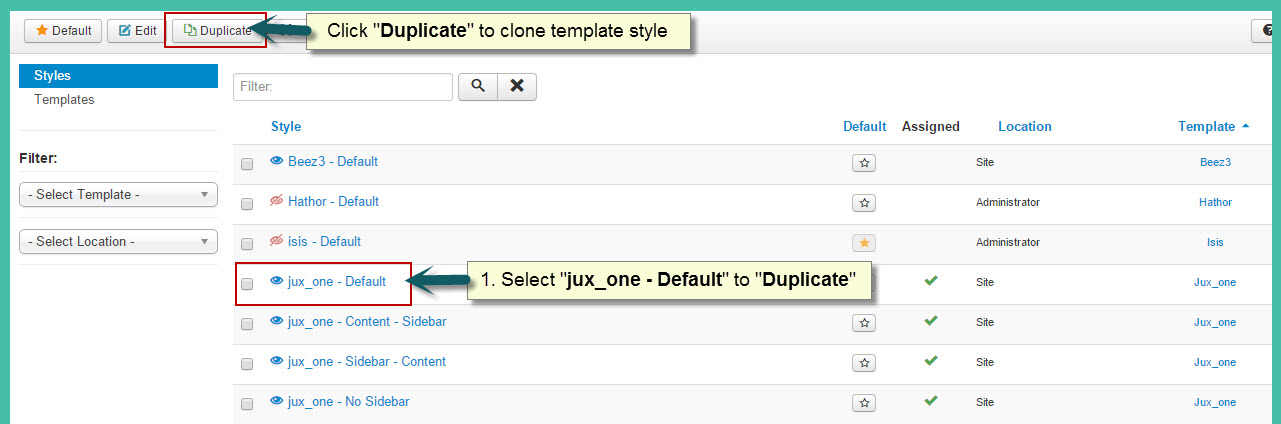
- Step 2 : Assign the template style for menu items:
The duplicated template style inherits all settings from its parent template style except the menu assignment (the cloned template style is not assigned to any menu items). Open the cloned template style → Menu Assignment, then assign the template style to menu items. Those menu items will have template style overridden the default template style.
2. Layout Configuration
2.1 Layout Structure configuration
2.1.1 Clone layout:
To quickly create new layout, clone layout in the layout setting panel, all you have to do is hit the “Save as Copy” button. If you are new to T3, you should clone layout to customize so that you always has backup layout.
2.1.2 Switch layout for any template style
Open any template style, go to "Layout" tab, switch layout for current template style.
2.1.3 Assign module position
To assign module position, hover the position you want to change, hit the setting icon then select position. To change number of positions for spotlight block, just select number of position in the spotlight block

2.2 Responsive layout configuration
2.2.1 Select responsive layout
In configuration panel, you will see supported responsive layouts: Large, Medium, Small and Extra Small, select responsive layout to configure.
2.2.2 Disable any position
For responsive purpose, some elements in your site does not fit in specific layout, you can disable the position in the layout. The configuration is only applied for current layout.

3. Layout customization
JUX Designer template is built with T3 Framework , you can refer to T3 documentation for more detail:
4. Theme magic configuration
ThemeMagic is to customize your themes based on pre-define parameters without changing any style file.

Firstly, you have to enable the "ThemeMagic" feature. Open any template style manager, in the General tab, enable the ThemeMagic option. Next, hit the "ThemeMagic" button on the top bar list to open the ThemeMagic working panel
Customize your theme with pre-defined parameters
-
Step 1: Select Theme: all theme will be listed here , select theme you want to customize
-
Step 2: Custom your theme with pre-defined paramers. In the setting bar, open the parameter group you want to configure, change value for the pre-defined parameters.
-
Step 4: Hit the Preview button to view the changes, if you satisfy with the changes, please save as the theme.

Adding new group and parameters to ThemeMagic
If you want to add new group, parameters to ThemeMagic to customize your themes, please refer to T3 documentation.
MEGAMENU CONFIGURATION
1. Megamenu configuration and customization
1.1 When disable Megamenu
When Megamenu is disabled, the template will use Joomla drop down menu.
To disable Megamenu, open Template style manager, in the “Navigation”tab, disable “Megamenu” option

1.2 When enable Megamenu
Megamenu allows you to display your main menu in different ways and flexibly. You can display menu items in columns, add icon and style for menu item, load module for a module menu item..
1.2.1 Enable megamenu
Open the template style that you want to enable Megamenu, go to Navigation tab then enable the Megamenu option.

In the configuration panel of Megamenu, select menu item/submenu/column or row to configure.
For more detail of how to work with Megamenu, please check out the references below:
-
Megamenu options: how to use options in the Megamenu configuration panel like: how to enable sub-menu, how to assign module, how to add new column/row, etc >> detail documentation
-
Style Megamenu: how to add style for a menu item, sub-menu, column or row in Megamenu >> detail documentation.
-
Add icon for menu item in Megamenu: how to add icon for menu item in Megamenu: Font awesome icons and Bootstrap icons >> detail documentation
-
Animation configuration: multiple animation types for Megamenu: Fading, slide, elastic, room >> detail documentation
-
Video tutorials: how to work with Megamenu configuration panel >> view video now
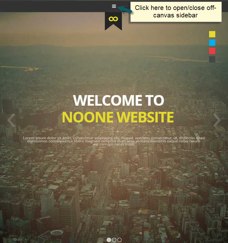
2. Off-Canvas Configuration
The new Off-canvas sidebar is now independent with Collapse Navigation for small screens. The Off-canvas sidebar displays content from defined position.
2.1 Enable Off-canvas sidebar
To enable Off-canvas sidebar, open Add-ons tab then enable Off-canvas sidebar

Assign module position to Off-canvas sidebar. By default, Off-canvas will be assigned to off-canvas position

Add content for Off-canvas sidebar by creating modules then assign them to off-canvas position

Frontend appearance
Use Off-Canvas as Navigator in small screens
In case you want to display Off-canvas sidebar as navigation in small screens like tablet, mobile, please disable Off-canvas sidebar in responsive layout.

LOGO CUSTOMIZATION
Here is frontend of JUX One

1. Change the Logo image
There are 2 ways to change logo for JUX One template
#1: Change logo from Template Manager
Each style can go with different logo. To set style for the logo, please go to Extensions→Template Manager→ select Theme you’re using. Select image for logo on your site as shown in picture below:

#2: Change the Logo from the variable.less file
Another way to change logo is changing logo image path in variables.less file, which is located in template/jux_one/less
// TEMPLATE LOGO

// --------------------------------------------------

@t3-logo-image:               "@{t3-image-path}/logo.png";
2. Logo Styling
To customize style for logo, open file style.css that is located in the template/jux_one/less/style.css folder. Search for the logo text, you’ll find the style where you can either add more styles or customize it as you want.
// Logo Image

// ----------

.homepage {

  .logo {

    @media screen and (max-width: @screen-xs-max) {

      float: left !important;

    }

    .logo-image {

  // Hide sitename and slogan

  //overflow: hidden;


  a {

    display: inline-block;

    background-image: url("@{T3-Logo-Image}");

    background-repeat: no-repeat;

    width: @T3-logo-Width;

    height: @T3-logo-Height;

    text-indent: -9999px;

    line-height: 1;

    margin: 0 auto;


    @media screen and (min-width: @screen-md) and (max-width: @screen-md-max) {

      background-size: 100%;

      height: 100px;

      width: 90px;

    }


    @media screen and (min-width: @screen-sm) and (max-width: @screen-sm-max) {

      width:88px;

      position:relative;

      z-index:9999;

      background-size:100%;

    }


    @media screen and (max-width: @screen-xs-max) {

      width: 55px;

      height: 63px;

      position: relative;

      z-index: 9999;

      margin-top: 38px !important;

      background-size: 100%;

      margin-left: 36px;

    }


    @media screen and (max-width: @screen-xs) {

      width:40px;

      height:45px;

      background-size:100%;

      margin-top:38px !important;

    }

  }


  //hide sitename and slogan

  span, small {

    display: none;

  }

}